On Fri, Nov 22, 2013 at 9:47 AM, Drummond Reed <drummond.reed@xdi.org> wrote:
On Thu, Nov 21, 2013 at 1:48 AM, Markus Sabadello <markus.sabadello@gmail.com> wrote:
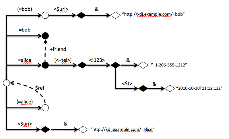
I like it.. I think writing an automatic diagram generator for this technique would also be significantly easier than for the old one.Agreed.One input I have is that the outer root should probably also be drawn as a circle, even though it has no address.It is drawn as an open circle. It's the circle at the far left edge. It's the starting point for all arcs.MarkusOn Thu, Nov 21, 2013 at 9:14 AM, Drummond Reed <drummond.reed@xdi.org> wrote:
As I prepare diagrams for the XDI Core spec, using the updated notation we agreed on, I just wanted to share a new way of laying them out that makes drawing them much easier and more uniform, as well as making them easier to read. An example is below, with notes following that.Notes:
- What makes it easier to read is:
- Everything except relational arcs reads left-to-right, just like XDI statements.
- The outer root node is always the far left edge—the starting point (with no address)—exactly like an XDI statement.
- For contextual arcs, labels are directly above each horizontal line.
- Relational arcs stand out because they are the only curved lines.
- It is easier to see the transition points between roots, entities, attributes, and values.
- What makes it easier to draw is:
- All contextual arcs are straight lines—either directly horizontal, or vertical+horizontal—which means in most drawing tools like Powerpoint or Visio there is a connector shape that does this automatically.
- It is easy to vertically align nodes to see "levels" of contextual nesting.
- It is easy and fast to adjust sections of the graph up or down to make room for new statements.
Please post any thoughts about further ideas or improvements -- this is the format I plan to use for XDI Core spec illustrations.Also, I can post the Powerpoint file I'm using to make these, but the format is trivially easy (the only secret is to made the circle and diamond shapes exactly the same height so that everything snaps to grid easily).